top of page


VIDCADE
Making gameplay feel more personal than public.
ROLE
Founding Designer
SKILLS
End - End Product Design, Design System, Brand Identity
TIMELINE
3 Weeks, Ideation - Launch
OVERVIEW
Vidcade is a social gaming app where users compete in daily challenges to win cash prizes. After our initial launch the team was preparing for a fundraising round, but key engagement numbers were too low. Our numbers showed that only 14% of users completed core gameplay flow after sign-up, and average session time hovered around one minute. By running user research and data analysis, I redesigned the experience to feel more personal and friend-focused. Within weeks, these changes doubled activation rates to 30%, tripled average session time from 1 to 3 minutes, and unlocked a new acquisition channel, helping position the company for growth ahead of the raise.

THE CHALLENGE
Expectations vs. Reality
Our early version of Vidcade had all the right ingredients for virality


An Overall Leaderboard


Daily Prize


Incentives for sharing
INITIAL PROBLEM
Our initial launch saw success. We targeted one High School and invited 10 students to play. Within a couple of hours our 10 students multiplied to hundreds of students all playing, creating, and sharing videos. So we began to expand to other schools and even university campuses. However, as more users came on to play, we noticed an issue...our users started getting shy.


Not Playing
After onboarding, users weren't playing

Hesitation to post publicly
Many users felt self-conscious posting silly videos as more users from different schools started playing
RESEARCH
A Look into the Data
Through interviewing our users and behavior tracking with mixpanel we uncovered some key insight

Mixpanel data showed us users were not posting
Our Mixpanel data showed that new users were downloading and signing on to the app. However, only around 14% of these new users were actually pressing play and submitting a video into gameplay.

Contacts page was our 2nd most visited page
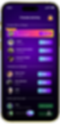
Our most visited page after the prompt wasn’t the leaderboard, it was the contacts page, tucked away in their profile. This page had a feature that showed if your contacts was on the app and whether that contact had played.
CURRENT USER JOURNEY
After conducting our research we mapped out a typical user journey through the app. Users would enter the app and see the prompt of the day then check to see which of their friends played before leaving the app and returning when the winners were announced

STEP 1
View Prompt

STEP 2
Check Contacts

STEP 3
View Leaderboard


CRITICAL PRODUCT QUESTION
How might we make Vidcade feel more like a game you play with friends, not with an audience?
DESIGN SHIFT
Friend Group Feature
We reframed our user flow by redesigning the entry point to highlight friend groups


DESIGN SHIFT
Private Play UI
Redesigned the user interface to emphasize private play. Introduced privacy filters so only group members could view videos. We utilized these privacy spaces to encourage users to add each other as friends


Only friend group members can view each others videos


Encourage users to add each other as friends

DESIGN SHIFT
Friend Group Feature
FEATURE
While ideating on our redirection, I had an idea to add a smaller leaderboard for each friend group while gameplay was running.
WHY?
-
We had the back-end logic
-
Implemented in 2 days
-
Low-cost + High-impact
OUTCOME
Measuring our Success
Our new friend group features alongside the new funniest friend leaderboard brought up not only our retention rates but also our average app session length
BEFORE
1.8
Min
Ave User Session
14%
Activation Rate
AFTER
3.4
Min
Ave User Session
30%
Activation Rate
REFLECTION
The Takeaways
This project taught me that good UX isn’t always about going bigger, sometimes, it’s about going closer. By shifting Vidcade from a public viral platform to a friend-focused experience, we unlocked a more authentic, comfortable way for users to engage. Designing around emotional safety, familiarity, and low-pressure fun led to a huge lift in engagement. The “Funniest Friend” feature worked because it mirrored real behavior, people already share funny videos in group chats. We just gave that instinct a home.
RECOGNITION

bottom of page